Does your indicator have an edge?
It’s a great question to ask, if you use indicators to make your decisions. I bet a lot of people blindly follow them in the beginning, without really having an answer. You might ‘think’ your indie has an edge. You might have been told it gives you an edge. But, I’ve found that unless you have real confidence in it, and in my opinion that comes from really digging into it and running the numbers yourself, you may not have faith to execute properly from it, even if it gives you good signals.
So, how do we test if something has an edge? What can keep us on the right side of the market. Would it not be wonderful to have a rule, don’t buy under this line, or sell over this one? I wanted a simple way to test this myself, so here is what I came up with. It’s very simplistic. I stand by for my assumptions to be corrected by anyone, so please feel free to add to the discussion. After all. We are all learning here, right?
The plan
I’ve coded a large number of indicators. I wanted some reusable code to add to them. This is what I came up with. Let’s assume we are testing a simple line/plot. You buy over the 50 when it’s green, you sell under the 50 when it’s red. Simple, right? Most people still won’t be able to do it. So, come up with some numbers to convince yourself.
The logic
We count closes up and down above the line, closes up and down below the line, and, although we could use a range chart, we are going to consider the range up and down, too (bars might close up, but be small, giving us a false impression of our edge). So, we are above the line and we get a bar that closes up, we increment the barsUpAbovetheLine counter, and add the range of the Close-Open of the bar to our range counter. Make sense?
The test
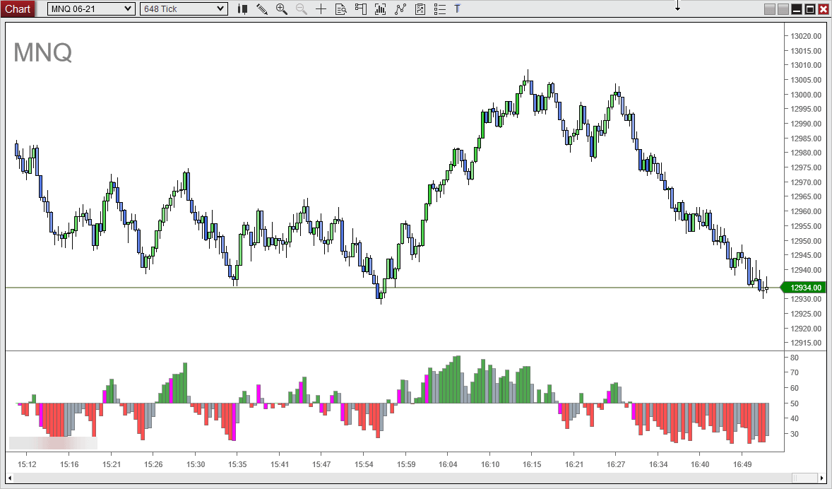
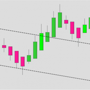
For this test, I will use my own oscillator. It’s bit of a multi-tool. It can plot a few types of RSI, Slopes, etc. In this mode, it’s plotting a traditional RSI as a histogram on a 648 tick MNQ chart. Bars above the midline are considered bullish, below, bearish.
So, enough talk. If we implement our code, what do we get?
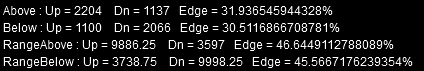
The results
So, this is telling us that over our chart period of 7 days, there are approximately twice as many bar closes up, than down, with the indicator is above the midpoint, with a 30% additional edge (I’m honestly not sure if I’m calculating that correctly!) and vice versa. In terms of range, there is approximately 46% edge to the up side when above the line, and 45% more to the downside, below the line. So, taking into the account the range of the bars does appear to be a good idea.
Conclusions
What can we conclude from this, really. The indicator is, after all, only reacting to price. It’s not predicting. Well, what do you think? I’d have to say, if that edge is anywhere near accurate, then you would have to seriously consider why you might buy below the midpoint, and sell above it, right? Sure, there will be edge cases, but attempting to trade those can get you into trouble fast, somtimes!
If you implement the above idea in any of your own indicators/code, let me know your results! I’ve now added this to most of my indies. It allows me to easily change the timeframe, indicator period etc. and see in a few seconds, measured over a month or so of usage, if the edge changes. That’s pretty useful, if you ask me. It also highlights a few indies that apparently have no edge at all – They look pretty though 😂
Always up for a discussion on these things, so feel free to comment below, hit me on Twitter, etc. Good luck traders.

Hello there! This is a GREAT post. Any chance you could share the code you used to run the analysis?
Thanks!
Matt
Thanks. I’ll see if I can dig out the original code and share it.
That would be super cool… or even a little direction how you ran the numbers. Strategy Analyzer?? Custom script?
Thanks!
Hi, As my code will not be directly applicable to anyone anyway, I will explain what I did. All my indicators have a BIAS. 1, 0, or -1, All I did is, if the BIAS is one, count the bars up and down for that BIAS. If the BIAS is -1, count the bars down and up for that bias. The BIAS could be, slope increasing, price above/below, etc. However you expect to use that indicator. At the end of that, you can say, if the BIAS is 1 (long), and there were always more up bars in that state than down bars, it might seem to make sense to be a buyer, rather than a seller during those times. It is a really simplistic approach, and as I said, I counted the range too to allow for variable sized bars. Some common indies appear to have little edge, others make you question why you’d ever go against them! I hope this helps.
Interested in this concept. How can i code this?
Awesome explanation! Thanks for your help!! Off to buy a license for the Tamer… 🙂